Quandl integration
The purpose of this example is to show how to integrate any time-series data in CSV format into a strategy.
We’ll use the following CSV data from Quandl: http://www.quandl.com/OFDP-Open-Financial-Data-Project/GOLD_2-LBMA-Gold-Price-London-Fixings-P-M
from pyalgotrade import strategy
from pyalgotrade import plotter
from pyalgotrade.tools import yahoofinance
from pyalgotrade.feed import csvfeed
import datetime

class MyStrategy(strategy.BacktestingStrategy):
    def __init__(self, feed, quandlFeed, instrument):
        strategy.BacktestingStrategy.__init__(self, feed)
        self.getBroker().setUseAdjustedValues(True)
        self.__instrument = instrument

        # It is VERY important to add the the extra feed to the event dispatch loop before
        # running the strategy.
        self.getDispatcher().addSubject(quandlFeed)

        # Subscribe to events from the Quandl feed.
        quandlFeed.getNewValuesEvent().subscribe(self.onQuandlData)

    def onQuandlData(self, dateTime, values):
        print dateTime, values

    def onBars(self, bars):
        print bars.getDateTime(), bars[self.__instrument].getAdjClose()

def main(plot):
    instruments = ["gld"]

    # Download the bars.
    feed = yahoofinance.build_feed(instruments, 2006, 2012, ".")

    # Load Quandl CSV from http://www.quandl.com/OFDP-Open-Financial-Data-Project/GOLD_2-LBMA-Gold-Price-London-Fixings-P-M
    quandlFeed = csvfeed.Feed("Date", "%Y-%m-%d")
    quandlFeed.setDateRange(datetime.datetime(2006, 1, 1), datetime.datetime(2012, 12, 31))
    quandlFeed.addValuesFromCSV("quandl_gold_2.csv")

    myStrategy = MyStrategy(feed, quandlFeed, instruments[0])

    if plot:
        plt = plotter.StrategyPlotter(myStrategy, True, False, False)
        plt.getOrCreateSubplot("quandl").addDataSeries("USD", quandlFeed["USD"])
        plt.getOrCreateSubplot("quandl").addDataSeries("EUR", quandlFeed["EUR"])
        plt.getOrCreateSubplot("quandl").addDataSeries("GBP", quandlFeed["GBP"])

    myStrategy.run()

    if plot:
        plt.plot()

if __name__ == "__main__":
    main(True)
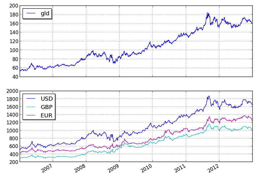
this is what the output should look like:
2006-01-01 00:00:00 {'USD': 513.0, 'GBP': 298.204, 'EUR': 433.533}
2006-01-03 23:59:59 53.12
2006-01-04 23:59:59 53.3
2006-01-05 23:59:59 52.34
2006-01-06 23:59:59 53.72
2006-01-08 00:00:00 {'USD': 535.25, 'GBP': 302.572, 'EUR': 440.173}
2006-01-09 23:59:59 54.6
2006-01-10 23:59:59 54.06
2006-01-11 23:59:59 54.53
2006-01-12 23:59:59 54.43
.
.
.
2012-12-19 23:59:59 161.69
2012-12-20 23:59:59 159.73
2012-12-21 23:59:59 160.33
2012-12-23 00:00:00 {'USD': 1651.5, 'GBP': 1019.256, 'EUR': 1253.701}
2012-12-24 23:59:59 160.62
2012-12-26 23:59:59 160.78
2012-12-27 23:59:59 161.16
2012-12-28 23:59:59 160.54
2012-12-30 00:00:00 {'USD': 1657.5, 'GBP': 1027.206, 'EUR': 1253.024}
2012-12-31 23:59:59 162.02
and this is what the plot should look like:
you can get better returns by tunning the Bollinger Bands period as well as the entry and exit points.